

Metrics exist to answer two questions: how good is the software we deliver, and is our testing approach actually working? AI-generated tests broke the old answers to both.
QA metrics were never really about numbers. They exist to answer two questions. First, how good is the software we are delivering to customers? Second, is our testing approach actually working, or are we just going through the motions?
Author: Yevheniia Sakovets, https://yevheniiasakovets.com/
For years, QA leads answered both questions with the same set of proxies: how many tests we ran, how many passed, what our coverage looked like, and how many bugs we found, broken down by severity. Those proxies worked because they reflected the health of the QA process. A suite of three thousand tests meant months of real work, a stable pass rate meant the product was under control, and a falling count of critical bugs meant quality was moving in the right direction.
Then AI test generation arrived and cut the link between those numbers and reality. Today one engineer with an AI tool can generate thousands of tests in an afternoon. The numbers still go up, but they answer neither question. If your quality story is still built on them, you are one hard question away from losing leadership’s trust: if AI writes all these tests, why do customers still find bugs?

Why the old numbers stopped reflecting reality
The test count broke first. AI floods both sides of the equation: teams receive AI-generated application code and respond with AI-generated tests. In the Sembi Software Quality Pulse Report, a survey of 3,800 QA and security professionals, 61 percent of teams said testing demand went up because of AI-generated code. When the product and the suite both grow at machine speed, a rising test count says nothing about whether risk is covered.
The pass rate broke next. Many AI tools write tests by reading the code they are supposed to check, so the tests confirm that the code does what the code does. Bugs get recorded as expected behavior, and the suite goes green. A 98 percent pass rate used to mean the product mostly works. Now it can also mean the tests mostly agree with the defects.
Coverage and bug counts fail in related ways. Coverage shows which lines ran, not whether anything meaningful was checked while they ran. And the bug count inflates just like the test count: AI-driven testing can surface hundreds of minor findings, so the total rises while saying nothing about whether critical risk is under control. A team can report more tests, more bugs found, and high coverage, and still be blind in the places that matter.
These numbers still measure something: how much testing activity is happening. They just no longer measure whether that activity protects the product. AI can produce endless activity on its own, so the numbers keep growing whether the protection is real or not.
Metrics that show the quality of what you deliver
My team hit this problem too. The dashboards were green, the numbers kept growing and yet they stopped telling us anything we could act on. The metrics below are the ones that proved useful when we rebuilt our reporting, starting from the customer’s side, because that is where quality is actually decided.
Defect escape rate is the anchor. Out of all defects found in a period, how many were found after we said the work was done, and how many reached customers? Report it by severity and trend it across releases. Its close relative, defect removal efficiency, expresses the same idea as a positive number: the share of defects caught before release. A sudden drop in removal efficiency is a red flag, even when every activity number looks great.
Production signals complete the picture: the trend of customer-reported defects, incident counts, and how long defects live before someone finds them. DORA’s change failure rate from Google’s State of DevOps research belongs here too, as a widely recognized industry benchmark.
Risk-weighted journey coverage replaces raw code coverage. Instead of lines executed, report the percentage of revenue-critical user journeys verified end to end: purchase, activation, renewal, upgrade. A checkout flow missing from that list can break in production without any test noticing, no matter what the coverage number says.
Metrics that show whether your approach still works
Most dashboards skip this second group, and it matters more than ever. In 1990, Boris Beizer described the pesticide paradox: every method you use to find bugs leaves behind subtler bugs that the method cannot catch. Run the same tests again and again – and they find less and less, while the software quietly grows immune to them.
AI makes this paradox worse, not better. Generative tools have tunnel vision: they produce tests from the same patterns, the same code, and the same assumptions, so a generated suite tends to attack the same spots thousands of times. You get the volume of an army and the perspective of one soldier. Without a metric watching for it, the suite decays while every activity number keeps climbing.
You do not need to wait for production escapes to see this happening. Internal new-defect yield is the first warning light: how many previously unknown defects each regression cycle finds on internal builds. A healthy, evolving suite keeps finding real problems. If the yield trends toward zero while the code keeps changing, the tests have stopped learning, and you know it before a single customer is affected.
Test freshness catches tunnel vision at its source. Measure what share of the code changed in a sprint received at least one new or updated test in the same sprint. AI generates tests from yesterday’s code, so a falling freshness number means the suite is aging in real time, no matter how large it is.
Defect detection by phase shows decay as a drift. Track where in the pipeline defects are caught: unit, integration, system, acceptance. If defects steadily move toward later phases, your early testing layers are losing their grip, and the trend is visible releases before anything escapes.
Source-of-discovery analysis shows where your findings actually come from. What share of defects was found by tests added in the last few releases versus the old core suite? What share came from exploratory testing versus automation? If humans exploring keep finding what thousands of generated tests miss, that gap measures exactly how shallow the generated suite is.
And when something does escape, blind-spot review closes the loop. For every escaped defect, ask one question: did any test in the suite even attempt to catch this? Classifying escapes into “test existed but missed it” and “no test ever looked there” tells you whether to fix tests or to fix the strategy that generates them.
Metrics for the AI-generated tests themselves
When machines write the tests, someone has to test the tests. Mutation score is the strongest tool for that: plant small, deliberate faults in the code and measure what share of them the suite catches. It changes the question from “did the AI write a test?” to “did the AI write a good one?” Said plainly: we planted realistic defects and our tests caught this percentage. Everyone understands pressing the test button on a smoke detector.
Two cheaper checks support it. Meaningful assertion rate, measured on a sample, shows how many generated tests verify real behavior versus just confirming nothing crashed. Redundancy rate shows how many near-duplicate tests you are paying for in CI minutes and maintenance time; tracking unique behaviors per hundred tests gives you a principled reason to delete, and it directly counters tunnel vision.
Owning the answer
Here is the audit worth running this week. Pull up your dashboard and ask, for every metric on it, whether it would survive a determined AI feeding it thousands of tests overnight. If a number would still mean something, keep it. If it would only get bigger, replace it with one of the metrics above.
You do not need all nine on day one. Start with defect escape rate, because it is the one number leadership already understands, and internal new-defect yield, because it is the cheapest early warning you will ever build.
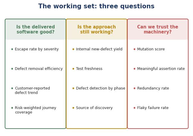
The working set should fit three questions. Is the delivered software good: escape rate by severity, defect removal efficiency, and the customer-reported defect trend. Is the approach still working: internal new-defect yield, test freshness, and defect detection by phase. Can we trust the machinery: mutation score, meaningful assertion rate, and flaky rate.
When my team moved to this structure, the shift changed from how many tests we ran to whether the regression suite was still earning its place. That is the question that keeps a QA process effective.
References
1. Boris Beizer, Software Testing Techniques, 2nd Edition, 1990 (the pesticide paradox).
2. Google DORA team, Accelerate State of DevOps Report 2024 (change failure rate and performance tiers).
3. “Shifting-right: beating the Pesticide Paradox in Automated Testing”, Smartesting blog, 2025 (test suite decay and diversity in AI-augmented automation).
4. “Why Mutation Testing Is Essential for Trustworthy AI”, Nimble Approach blog, 2025 (mutation testing as quality control for GenAI-written tests).
5. “21 QA Metrics Every High-Performing Software Team Should Track”, Abstracta blog, 2026 (defect leakage, defect detection efficiency, customer-reported defects).
6. “AI Is Breaking QA: Rethinking Quality Engineering in 2026,” QASource blog, 2026 (flaky tests, rerun-until-green culture, loss of quality signal).
About the Author
Yevheniia Sakovets is a QA Manager with 13 years of experience in software testing, test automation and AI-assisted quality engineering. She holds a Master’s degree in Computer Science and is PMP, ISTQB, and SAFe Agilist certified. Her experience spans fintech, healthcare, and e-commerce, leading end-to-end QA strategies, building automation frameworks and managing cross-functional teams with Agile leadership.
This matches exactly what worked for us, tying defect escape rate to release delay cost finally got leadership buy-in. Would love to hear if you found a metric that worked even faster than that.
This hits the nail on the head, Yevheniia.
In the trenches, we are definitely feeling the weight of the “AI green dashboard illusion.” Leadership sees 1,000 new generated tests and a 98% pass rate and assumes quality is bulletproof, but half those tests are just checking that the application didn’t crash, rather than asserting actual business logic. You end up burning CI/CD minutes on fluff while edge-case defects still slip right through to production.
Your callout on internal new-defect yield and mutation testing is where the real value lies.
Shifting the conversation away from volume and back toward risk-weighted journey coverage and test freshness gives us a pragmatic way to keep testing accountable to the end user, not the machine.
Love the article. Thank you!
The good question of this article: “if AI writes all these tests, why do customers still find bugs?” There is so much hype around AI for generating both code and tests, that I have the impression that by removing the human control on software organizations are just going drive more quickly towards the big hard wall of failure.
The important words about software testing metrics in this article is that metrics should measure whether the software testing activity protects the product, not just how much software testing activity is happening.